
Gamut Rings: Better Display Color Analysis
March 20, 2025
15 min read
Discover how Gamut Rings offer a clearer, more intuitive way to visualize display color performance.
Written by Chris Chinnock, Insight Media
The Gamut Rings diagram is a new way to visualize the color performance of a display. It has been standardized by leading metrology organizations, such as CIE, IEC and ICDM, so now is the time to educate professionals and even consumers on this new capability. In short, the Gamut Rings method provides an easier and more intuitive way to understand the color reproducing capabilities of the display—be it a cell phone, monitor, TV or any other display-containing product. It overcomes the limitations of commonly-used (and incomplete) color visualization methods like the 1931 and 1976 CIE diagrams that provide a 2D means of visualizing a 3D color volume as explained below.
How is Display Color Typically Visualized?
To assess the color performance of a display, one needs to understand the range of colors it can reproduce and how closely its color range is matched to a display standard specification. There are a number of display color specifications for different applications. The BT.709 specification has been widely used to describe color capability of TVs, monitors, and laptops, and has been used for standard dynamic range (SDR) TV signals. The DCI-P3 and BT.2020 standards cover larger color gamuts and have been used with high dynamic range (HDR) signaling and have been the basis for specification of more modern TVs, monitors, and mobile devices, while the Adobe RGB color standard is used for print and graphics applications.
These standards specify a range of colors that a fully compliant display should cover. Red, green, and blue primary colors and white point are described in terms of chromaticity. These primaries are different for each of these standards.
To determine the range of colors a certain display can reproduce, the traditional method of characterization involves displaying pure red, green, and blue patches and measuring their spectra. Since these red, green and blue colors are almost never fully saturated and cover a range of wavelengths, the CIE coordinate system was developed. The original 1931 CIE diagram shows the three colors plotted as (x, y) data points. Figure 1 illustrates the range of chromaticities in two TV standards, BT.2020 and BT.709. The horseshoe shape along the left, top, and right edge of the diagram traces a locus of monochromatic (single) wavelength colors, ranging from deep violet (shortest wavelengths) to deep red (longest wavelengths) that can be perceived by the typical human eye. The numbers on the periphery of the horseshoe are visible wavelengths in nanometers. Grassmann’s laws of additive color mixtures state that mixed colors lie within the RGB triangle. As this figure illustrates, these standards do not cover the full range of colors that most people can see.
CIE 1931 xy Diagram

Figure 1: BT.709 and BT.2020 standards plotted on the CIE 1931 diagram
The CIE organization updated the (x, y) coordinate system to one using (u', v') coordinates in 1976. This was done to make the color visualization space more “linear.” The intent of the CIE 1976 diagram (Figure 2) was that an equal distance in the color space between any two color points would correspond to the same amount of human-perceived change in color regardless of its location on the diagram.
CIE 1976 u’v’ Diagram
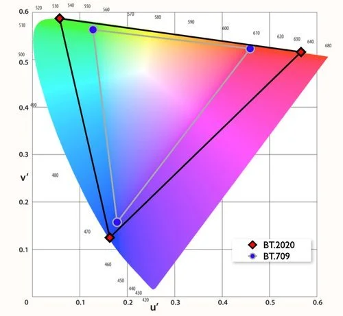
Figure 2: BT.709 and BT.2020 standards plotted on the CIE 1976 diagram
A particular display’s color performance has typically been plotted as a triangle in the (x, y) or (u', v') representations and its area compared to the area of a reference standard triangle. This has the advantage of perceived simplicity. If the display’s RGB triangle is big, it must be able to display a wider range of colors compared to one that is smaller. While this is true, it does not tell the whole story. That’s because the color performance of any display is three dimensional. In fact, the CIE in 1976 was very clear in defining color as being a three-dimensional property with the release of the CIELAB color space. That means that the colors a display can present are also a function of the luminance level of the picture. When the display is dim, the chromatic range may be limited but will grow as the luminance level increases. However, with some modern displays, the range of reproducible colors can also shrink at higher luminance levels, for example, when a white sub-pixel is used. Furthermore, as will be discussed, there can be serious shortcomings with such a two- dimensional representation of a display’s color capability.
CRT displays had a limited range of luminance, but modern displays can now reach several thousand nits with a goal of meeting the BT.2020 color range specified in the SMPTE 2084 standard for HDR. This means the color performance over this much wider range of luminance levels can vary significantly. As a result, analyzing a display’s color capability at a single luminance level does not reveal its color performance over its wide luminance range. Consider also that chromaticity diagrams do not distinguish between (for example) white vs. gray, orange vs. brown, or bright green vs. forest green – in each case, the color appears in the same place on the chromaticity diagram. For this reason, standards organizations have begun to refer to the triangular area on a 1931 or 1976 diagram as being chromaticity gamut, as opposed to color gamut, which is three dimensional.
The key takeaway here is that colors need to be defined not only by their chromaticity (hue and saturation) but by their chromaticity and luminance.
What is Color Volume?
To overcome some of the shortcomings mentioned above, color scientists have moved to the concept of describing the three-dimensional color performance of a display using a color volume methodology. The idea is to measure the color range of the display at dozens of different luminance levels. While doing so may sound easy, until recently it has been a time consuming and math- intensive measurement process.
Color volume also uses a different coordinate space. (x, y) or (u', v') are replaced with the coordinates a* and b*, with a third coordinate called L*. Figure 3 shows the color volume of a display in this Lab space.

Figure 3: Color volume representation in Lab
The Lab color space is designed to be perceptually uniform, meaning that the same amount of numerical change in these values corresponds to about the same amount of visually perceived change. L* ranges from 0 to 100, where 0 is black and 100 is normalized to the peak white luminance level. Essentially, L* measures how light or dark a color is, independent of hue and chroma. The a* axis represents the color or hue component from green to red. Positive values of a* indicate red, while negative values indicate green. The b* axis represents the color or hue component from blue to yellow. Positive values of b* indicate yellow, while negative values indicate blue. Any color in the Lab space is represented as a combination of these three values: lightness, and the color-opponent dimensions, a* and b*. Points near the center of this volume have reduced saturation or chroma. Moving toward the exterior of the volume indicates the ability to present deeper hues of the colors.
While measuring the display’s color performance in the Lab color space provides much more data and a better understanding of the display’s true color performance, it has some drawbacks For example, the odd-shaped color volume figures can be visibly quite different on various displays, but interpreting the results can be very challenging. Large volumes are generally better than small volumes but seeing the color performance difference at various lightness (luminance) levels can be difficult to determine. Figure 3, for instance, needs to be evaluated from different perspective views to truly assess color coverage throughout the plotted solid shape.
Get the latest from Nanosys every Monday at 10:00am.
Secondly, it is also very challenging to make comparisons between such complex shapes to understand where the color performance is strong or weak. Moreover, comparing a display’s color volume to a reference standard such as BT.2020 would also require many perspective views to evaluate where the display can reproduce a specific color (or color range) versus where it does not have coverage.
Therefore, industry has needed a better approach to measure and present true color capability, as well as a means of plotting an inherently 3D property on 2D media. To address this need, Japan Broadcasting Corporation (NHK) pioneered a tool called Gamut Rings. It is notable that in recent years, Gamut Rings have been written into standards from key organizations including SID’s ICDM (IDMS 5.32), the IEC (such as 62977-2-1, 62977-2-2, and 62906-5-1), and the CIE itself (such as CIE 246).
Gamut Rings Basics
The idea behind Gamut Rings is to simplify the interpretation of the color volume. First, the Gamut Rings specification requires that the lightness be normalized so that peak white luminance is equal to L*100, thus the raw data is mapped to the relative 0 to 100 L* scale. For HDR displays, L*100 could be 1000 nits or a higher level (note: The HDR L*100 level is not yet specified by the CIE or any other standards setting organization but should be stated in any published result, as this could be a way to manipulate the data).
In Figure 4 (a) shows the color volume representation of the color standard BT.2020 in the D50 CIELAB color space. (a) shows this volume representation divided into ten ranges (L* = 0–10, 10– 20, ..., 90–100). In Figure 4 (b) each L* range segment is transformed such that their sides are vertical while retaining their volume. In the operation depicted in (c), the plates are compressed to create a one-lightness thick “slice.” Figures (d) and (e) illustrate how a “ring” of data is created for each slice by removing lower- and higher-level values. To create the Gamut Rings graphic depicted in (f) a mathematical mapping process is undertaken. Think of this mapping process like the rings of a tree, or like a projection operation. As the projector is moved further from the screen, the image gets larger. As one shows a higher L* range, the gamut ring is stretched in a series of ever larger rings to enable a 3D volume to be represented as a 2D image. As a result, (f) illustrates what the BT.2020 standard looks like as a Gamut Rings representation.
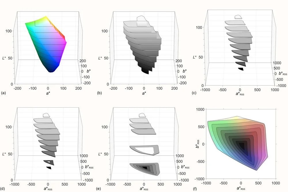
Figure 4: Gamut ring framework: (a) gamut solid is divided into pieces at regular L* intervals of 10; (b) pieces are transformed such that their sides are vertical while retaining their volume per hue angle; (c) plates are stretched to be one-lightness thick; (d) the second lowest plate stretched with a hole is wrapped around the lowest plate; (e) the sixth ring is to be wrapped around the lower five rings; and (f) gamut rings of BT.2020 in the D50 CIELAB color space. (Note: The D65 CIELAB color space is used for the color scope.)
Using Gamut Rings
While showing the Gamut Rings diagram for a reference standard is important, one ultimately wants to measure the performance of a display and compare it to a reference standard like BT.2020. This diagram is called the Gamut Rings Intersection.
To do this, one first measures the color volume of the display and uses the process described in Figure 4 to create the Gamut Rings data. Figure 5 illustrates how the display’s Gamut Rings data is compared to the BT.2020 reference standard (the black rings). Wherever there is gray in the image, it means the display is unable to present those colors to the full saturation (chroma) of the reference standard. For the case shown in Figure 5, it shows that the display is unable to reproduce all the colors in the reference standard over a wide range of lightness (luminance) values.
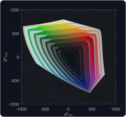
Figure 5: Final Gamut Rings result with measured data and BT.2020 target
Why Gamut Rings Matter
While color volume metrology addresses the need to describe color with chroma and luminance, it does not address the simplicity concern or make it easy to compare the performance between displays. Gamut Rings helps here and can eliminate the inaccuracies of chromaticity gamut measurements
Figure 6 shows data from two displays fabricated with different color-generating technology. Note that when each display is evaluated using CIE 1976 (u', v') criteria, both displays appear to have essentially the same color coverage, with 98% and 99% coverage of the DCI-P3 reference standard. The chromaticity plots are nearly the same. But when evaluated using Gamut Rings, the difference in capability of the two displays is quite clear. One display only covers 51% of the volumetric DCI- P3 standard over its full luminance range while the other covers 98%. That’s a huge difference that is visible to the eye. Display 1 clearly is unable to render highly saturated colors in the upper luminance ranges of DCI-P3.
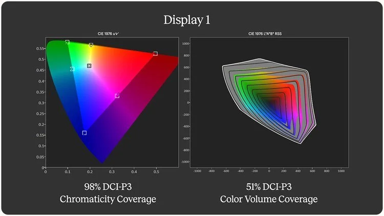
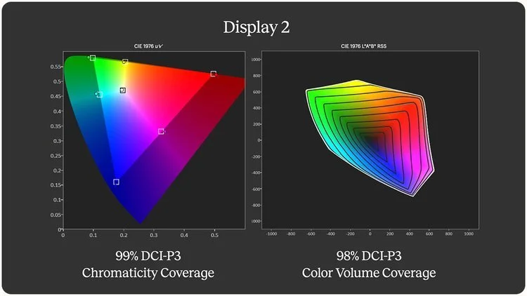
Figure 6: u'v' vs. Gamut Rings color data for two displays
Using chromaticity diagrams or color volume graphics and numbers to describe color performance has limitations, and they can lead to marketing shenanigans. Area coverage of a reference standard can be reported by total area (which can be greater than 100% of a reference standard) or by the area within a reference standard (intersection with the real reference, so ≤100% of the reference). The method is often not stated. More broadly, especially with modern displays, reporting of color capability using CIE 1931 or 1976 can be very misleading as shown in the example above.
The same specsmanship can happen with color volume data. Since it is based on the normalized lightness scale, measurements are all relative and need to be normalized from the display data. As a result, a display that can go from 0.005 nits to 2000 nits may in fact have a volume that could” look” very similar to a display that can only go from 0.5 nits to 500 nits when this data is “normalized” into lightness values. In essence, a standard dynamic range display might have a color volume that “looks” like a high dynamic range display, which would be extremely misleading. All these issues create marketing loopholes that companies can manipulate to characterize their display in misleading ways. It is important to remember that color volume is only one measure of a display’s capability. Peak luminance, contrast ratio, and a long list of other performance factors also have to be considered.
Gamut rings do not solve all the color understanding issues, but their use is a helpful step in the right direction. For one, the rings do a much better job of simplifying the complex three-dimensional color response into a more intuitive 2D representation. Secondly, the complexity of the acquisition and math processing has now become much easier for ordinary consumers, calibrators, reviewers and metrologists to use. Portrait Display’s Calman software now supports the acquisition of 602 data points for the creation of the color volume in Lab color space while also producing Gamut Rings Intersection diagrams to specific reference specifications.
Calman’s Gamut Rings Capabilities
Calman Studio and Ultimate, version 5.15.6 or higher, now support the acquisition of data and processing to display Gamut Rings color performance. These tools require a colorimeter or spectrometer along with a pattern generator to get started. When testing a display in the HDR mode, the metadata must be configured to specify the EOTF like HDR10 or Dolby Vision along with the window test pattern (10%, etc.). In the Gamut Rings section of the program, a reference target standard must be selected as well, such as BT.2020 or DCI-P3, for example. Once the process starts, the system will measure 602 data points over the full range of colors and luminance levels in the selected EOTF. The color volume is calculated, and Gamut Rings analyzed and an intersection diagram displayed. This whole process now takes only minutes to complete.
The resulting output shows a Gamut Rings intersection diagram similar to the ones in Figure 6 along with the minimum and maximum luminance values for the display, and the percentage coverage of the target (volumetric) reference gamut. Once the data has been acquired, one can change the target reference standard (from BT.2020 to DCI-P3 for example) or the EOTF to see how the display performs with different signals and modes. More analysis is possible as well.
These Gamut Rings capabilities in Calman are pushing the frontiers of display metrology. Since the metrology standards for HDR modes are still in development, this software has become a unique tool for evaluating displays in ways that have not been possible before. For example, this may include changing the average picture level used in the evaluation process (variable, constant, selectable) to uncover different features or artifacts of the display’s performance.
This tool is discovering new ways to evaluate displays, while also allowing for corrections and fine tuning of the software solution. And development work will continue to help answer many outstanding questions. For example, what patterns should be standardized for testing? Is that needed? Does a diffuse white point luminance value needed to be included or is reporting the Average Picture Level (APL) and peak luminance with the Gamut Rings data sufficient? Does more need to be standardized within ICDM, IEC or other organizations? Can Gamut Rings better explain the performance of the display in different ambient lighting conditions? Will they be helpful to evaluate reflective display?
Use Cases
Professionals like calibrators, reviewers and metrologists should consider adopting the use of Gamut Rings to assess the color performance of the display. The improved way to visualize the color performance of the display makes it much easier to do consistent color comparisons between displays. This is especially important for factory line display calibrations, for reviewers, and consumers to compare displays, and for metrologists to explore display performance in new and innovative ways.
Professional color grading should benefit from adopting Gamut Rings to deliver more consistent and accurate color throughout the production chain, from content generation to display. A Gamut Rings intersection diagram can also be used to monitor video to help identify and highlight pixels that exceed the target gamut, for example (Figure 7).
Figure 7: Gamut Rings used to monitor out-of-target pixels
Summary
The Gamut Rings method is a new way to look at the color performance of any display. It offers a simplified way of looking at 3D color performance of a display to create a 2D diagram that is more easily interpreted. Their use will offer big advantages in the ability to have a more consistent way to compare a display’s color performance while hopefully reducing some the marketing shenanigans sometimes seen around color reporting.

Gain clarity on Quantum Dot technology.
Excited about Quantum Dots but unsure to apply them to your tangible product? Our team answers your big questions about this tiny technology.