Color of the year for 2013 falls outside sRGB gamut
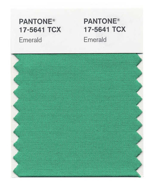
Pantone Emerald 17-5641
Pantone recently announced their color of the year for 2013, a deep shade of emerald green that they call “Emerald 17-5641.” It’s a great color but there’s a catch- most displays cannot accurately show it.
Based on data from Pantone’s website, I was able to plot the color in CIE 1931 (xy). As you can see in the chart below, Pantone’s color is well outside the sRGB/rec.709 color gamut standard used by most HDTVs, the new iPad/iPhone and many desktop monitors. These devices will be stuck showing a version of Pantone’s emerald green that’s less saturated and probably a bit more yellow than the real thing.
Pantone Emerald 17-5641 vs sRGB, Adobe RGB 1998 and DCI-P3 color gamuts in CIE 1931
This is a perfect example of a popular real-world color that falls outside of the sRGB/rec.709 gamut. Unless you have a monitor that’s able to show wider color gamuts, like the DCI-P3 or Adobe RGB standards, you are missing out on a great color.


